MY Portfolio Website
The challenging journey to a self-programmed website.
Overview
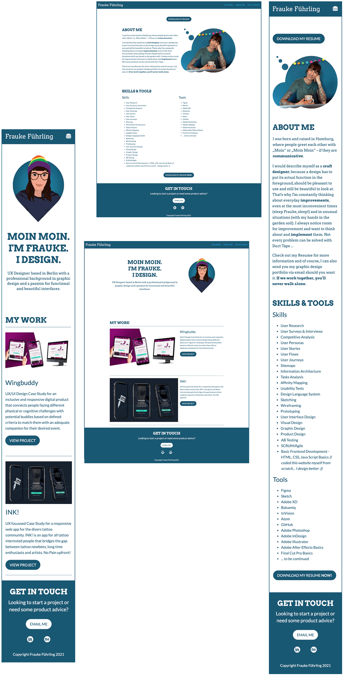
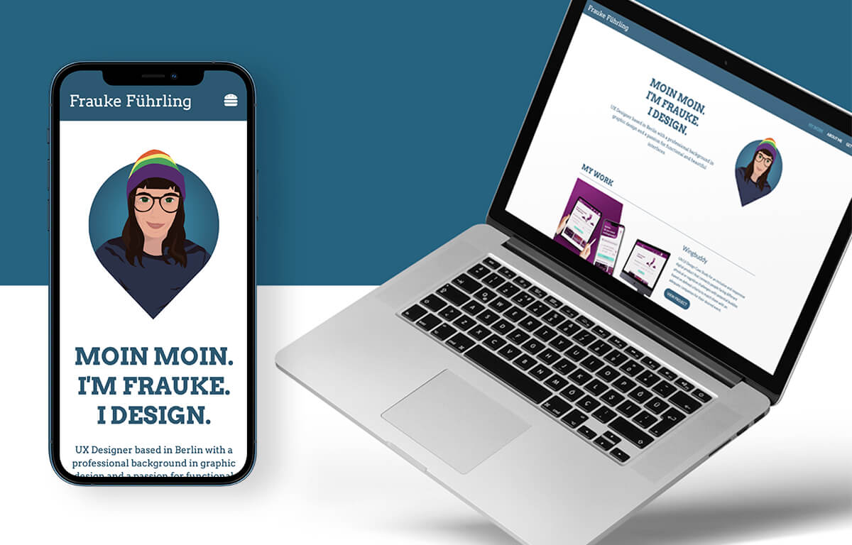
I created my own portfolio website to showcase my work to potential employers and other interested user. I coded the website myself to prove my HTML, CSS and JavaScript Skills that I acquired during the development. The limitations of my technical possibilities drove me crazy in the meantime. I would have liked to make the case studies much more appealing and interactive, but I had to realize that this was not possible for the time being. But I will continue to work on it.
Context & Challenge
The responsive website is the final project of my UX/UI-Journey with the Career Foundry. I started with a seven month intensive UX Design Course, followed by a UI Specialisation and the Web Development Course to round off my further education and experience to gain a holistic understanding of the challenges and opportunities of my new career.
Problem
At the beginning of the course I had no idea about programming and I was not very fond of it. Nonetheless, it's important to me and I have always tried to identify the respective issues, needs and responsibilities in a team and work environment in order to find the best and fastest possible route to the desired result. With the best possible background knowledge of the individual processes and responsibilities, I can deliver an even better product.
Goal
The overall goal was to sharpen my understanding of this side of product development and at the same time to create my own homepage from scratch to show what I'm capable of. I wanted to have a portfolio website whose content was completely created by me.

Process & Insights
I RESEARCHED
Various types of designer portfolio websites. After that, and what I knew about my future possibilities in the course, I needed to lower my own expectations of what I’ll be able to develop in the end.
I BRAINSTORMED
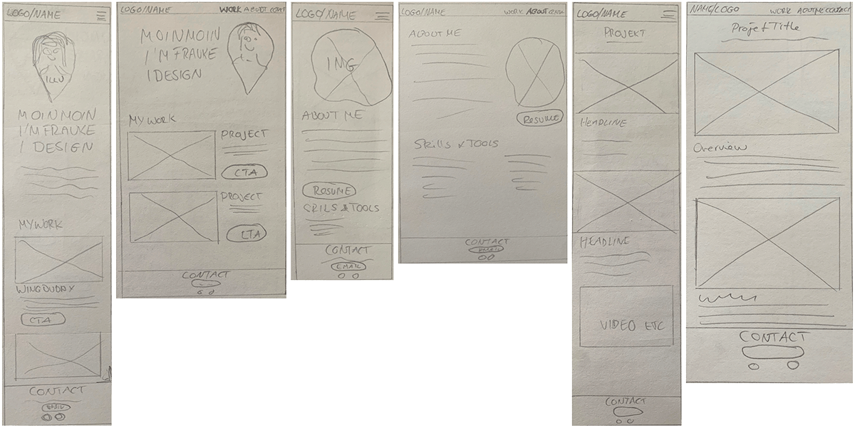
The content. I hand-sketched the layouts how I will arrange that content.
I CREATED
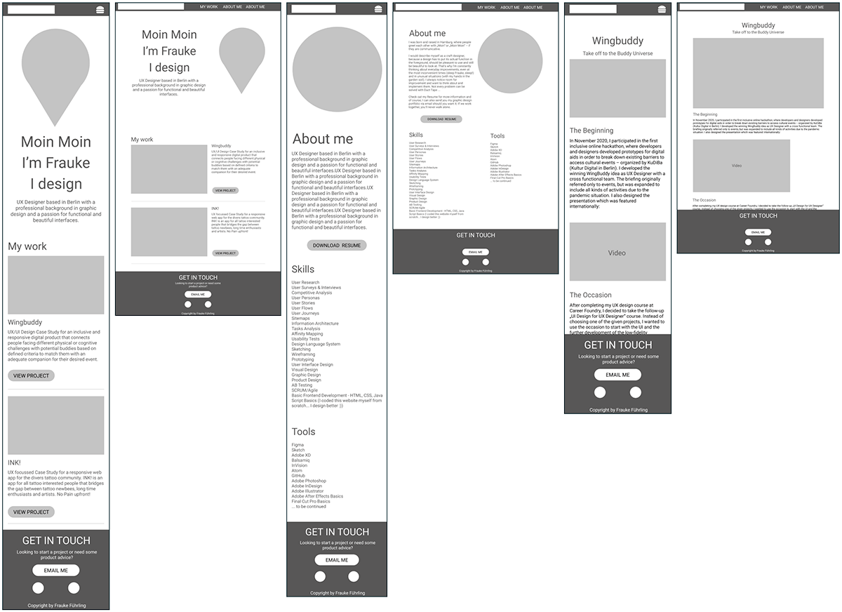
Mid-fidelity Wireframes. Made with Figma, to get a better understanding of my options.
I DECIDED
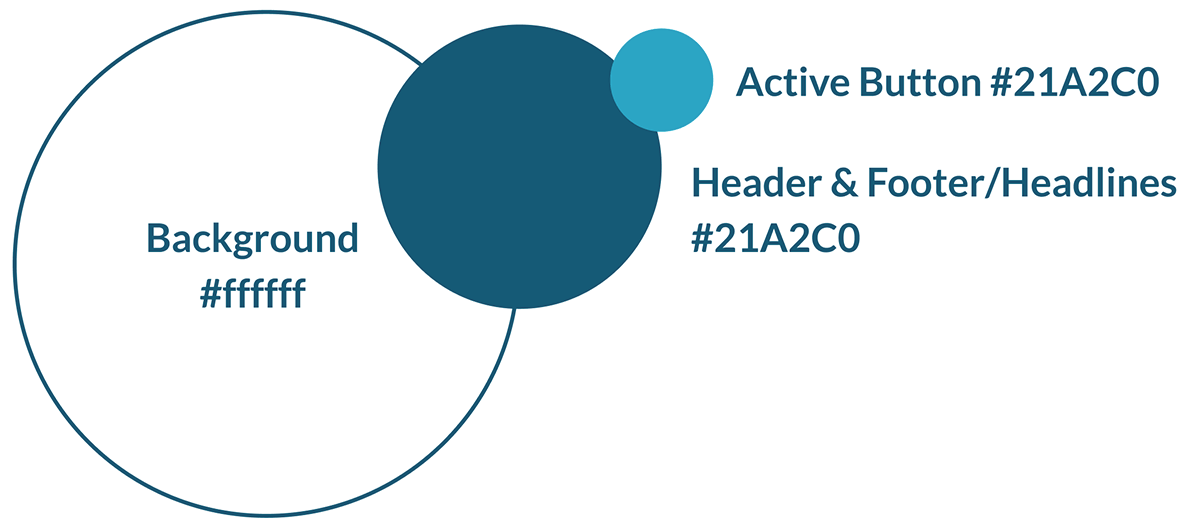
The Color Scheme. I wanted to create a light page that would match daytime reading habits, since my target audience tends to view my page during the day. In combination with a trustful and soothing petrol blue it underlines what I want to transport.
The Typography. I have decided to use the combination of two fonts. To pick up my print background, I decided to use the Typewriter-like Arvo as the eye-catching font. I use it for headlines and claims on the homepage and for headlines and the text about me. For the projects and all other copy texts I chose Lato as a sans serif and easy to read font.

I DESIGNED
My own Logo/Favicon. I used Adobe Illustrator to create an illustration from an image I already use with Behance and LinkedIn, to create an unique style and to show another skill that I have. The illustration represents a location icon to show that with me is the right place for a collaboration.
I SELECTED
Images, gathered and rewrote project text, chose a burger-Icon for mobile.
I WROTE
The code. Input of HTML, CSS styling, and JavaScript programming language/code into Atom. Designed using the mobile-first approach, then pain point display sizes.
I TESTED
User test with five participants from the business. I created five Senarios with following user goals to reach:
- View case study „Wingbuddy“ directly from the homepage
- See the next case study „INK!“
- Use mobile version now and navigate to the contact section
- Find the option to download the resume
- Navigate to my LinkedIn profile
I RANKED
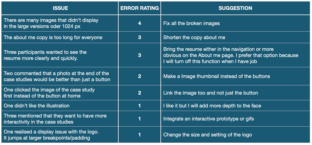
Usability Issues and Ranking according to NN metrics. The following rating scale can be used to rate the severity of usability problems:
- 0 = I don't agree that this is a usability problem at all
- 1 = Cosmetic problem only: need not be fixed unless extra time is available on project
- 2 = Minor usability problem: fixing this should be given low priority
- 3 = Major usability problem: important to fix, so should be given high priority
- 4 = Usability catastrophe: imperative to fix this before product can be released
I UPDATED
The usability catastrophe and major problems were fixed based on the user feedback.
I CLEANED
The code. Then I checked the website using cross-browser testing.
I MADE
A list with further improvements:
- Add more interactivity to the projects
- Give the user the option to jump from one project to the others via thumbnails
- Learn more development to to make the website, especially the projects, more appealing to my visual sensibilities.
Please be merciful, I will not be a super programmer soon, but I do know now how the wind blows in the developers cellar.
