Wingbuddy
Take off to the Buddy Universe
The Beginning
In November 2020, I participated in the first inclusive online hackathon, where developers and designers developed prototypes for digital aids in order to break down existing barriers to access cultural events – organized by KuDiBa (Kultur Digital in Berlin). I developed the winning WingBuddy idea as UX Designer with a cross functional team. The briefing originally referred only to events, but was expanded to include all kinds of activities due to the pandemic situation. I also designed the presentation which was featured internationally:
The Occasion
After completing my UX design course at Career Foundry, I decided to take the follow-up „UI Design for UX Designer“ course. Instead of choosing one of the given projects, I wanted to use the occasion to start with the UI and the further development of the low-fidelity wireframes I created as a result of the UX research during the hackathon.
My Role
Skills
- User Personas
- User Stories
- User Flow
- Sketching
- Wireframing
- Prototyping
- Visual Design/UI
Tools
- Pen & paper
- Figma
- Adobe Photoshop
- Adobe Illustrator
- UnDraw.co
The Process
People that face different physical or cognitive challenges often need an escort to attend cultural events. „Inklusion muss laut sein“ already has a database of over 3500 people who would be happy to accompany someone to a concert or a visit to the theater. However, they still have to search the entire list for each request to find suitable „match“ to make an accompaniment possible.
Problem Statement
Until now, there is no tool that allows people with disabilities to independently search for a companion who shares similar interests.
We need a tool that allows people to post an event and receive suggestions for volunteers that meet their own defined criteria.
User Persona
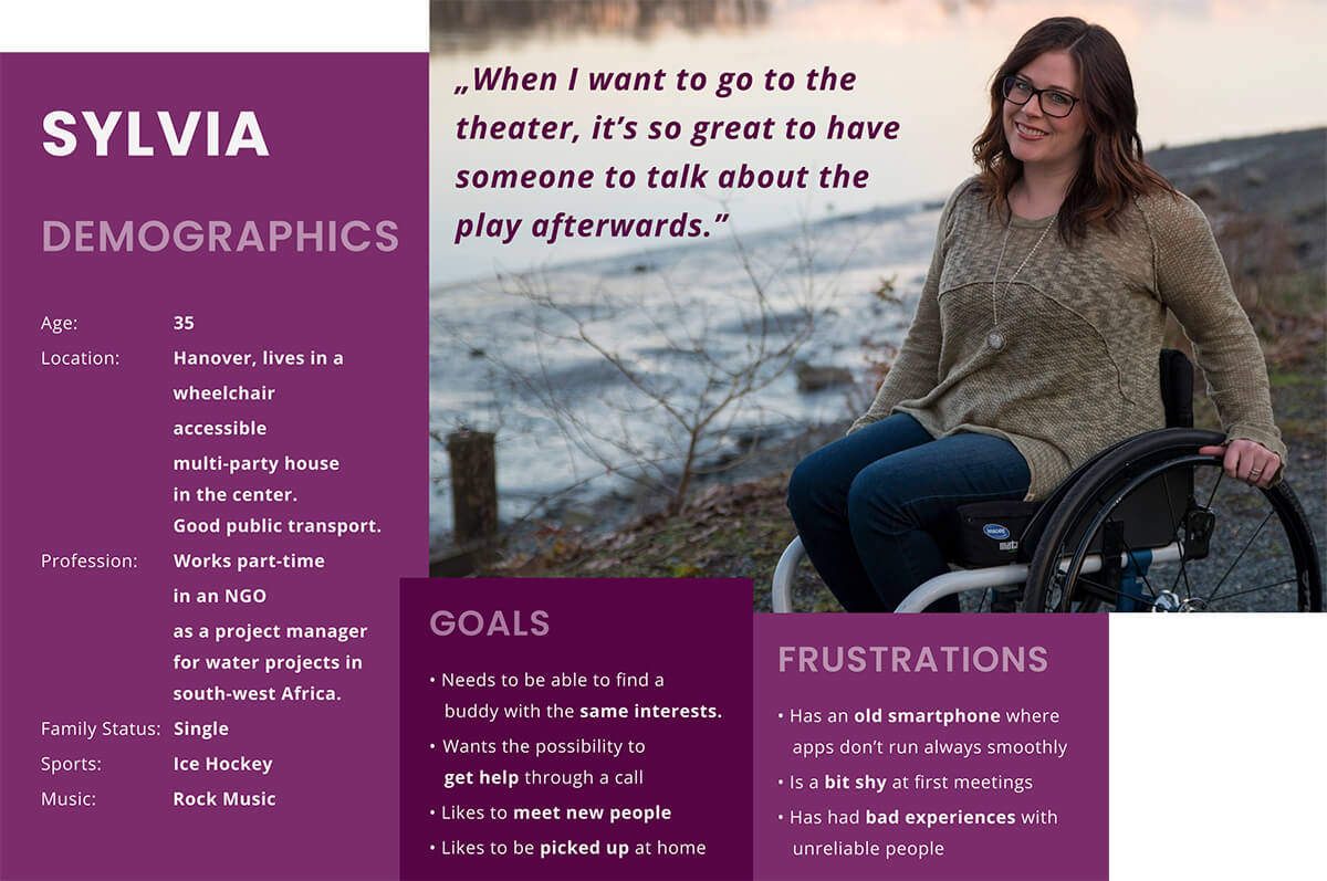
Based on the available information from the briefing regarding target group and user research, I further developed Sylvia as persona.
User Stories
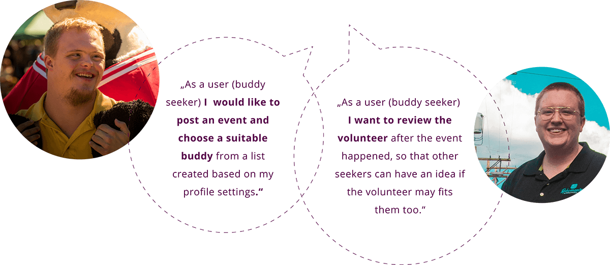
To better capture the perspective of my user, I have developed user stories based on the user research.
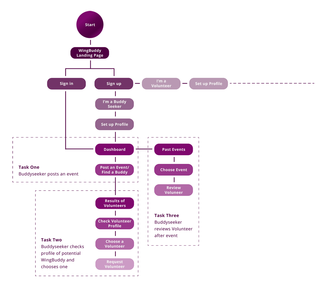
User Flow Diagram
Based on the given brief of user needs, I devised a user flow diagram to include relevant user flows.
Mood Board
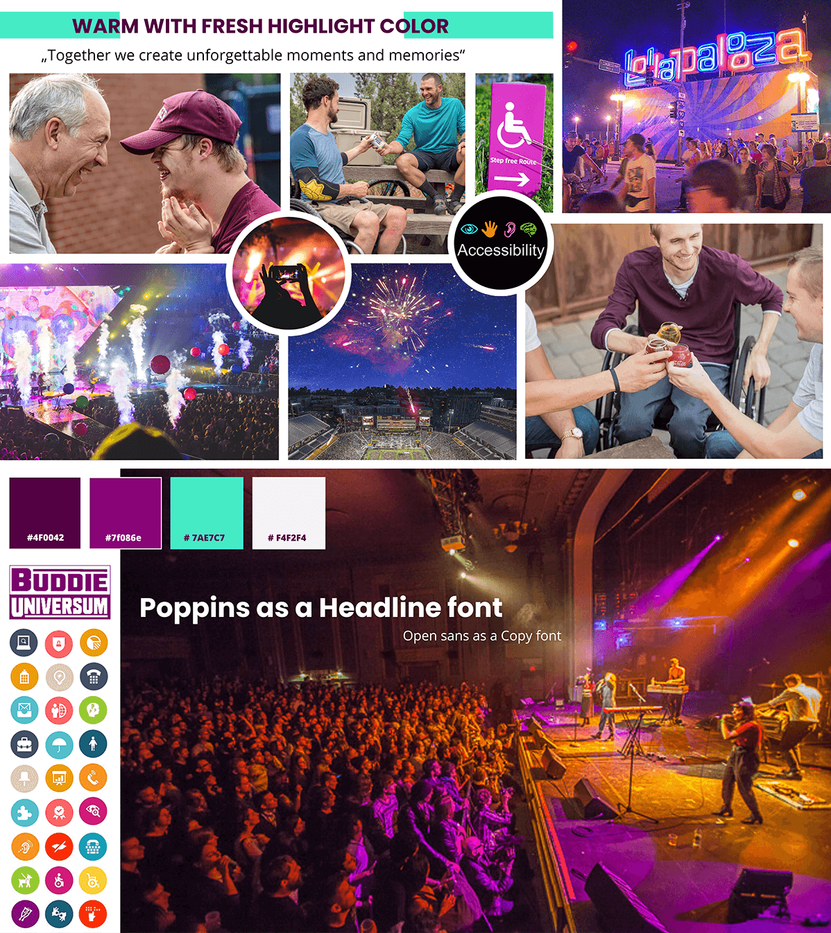
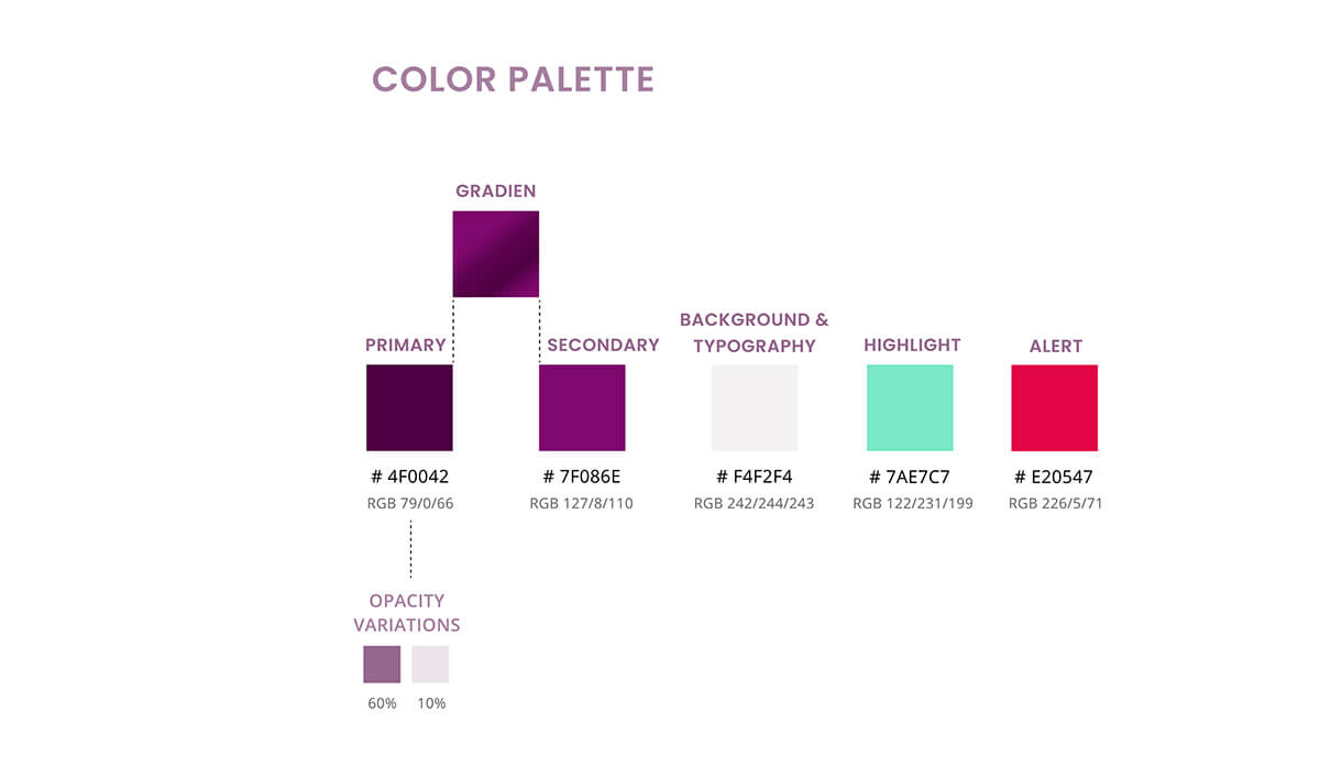
The starting point for the creation of the mood board was the color #7f086e, which has already been used by „IMLS“ before to promote the „Buddy Universe“ on their channels. I decided to use a darker purple as my primary color which combines perfectly the warm indoor and the fresh outdoor feeling I want to transport.
The Result
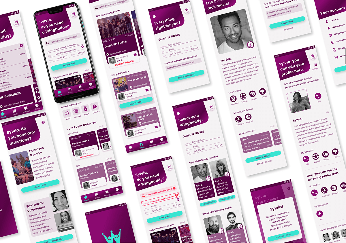
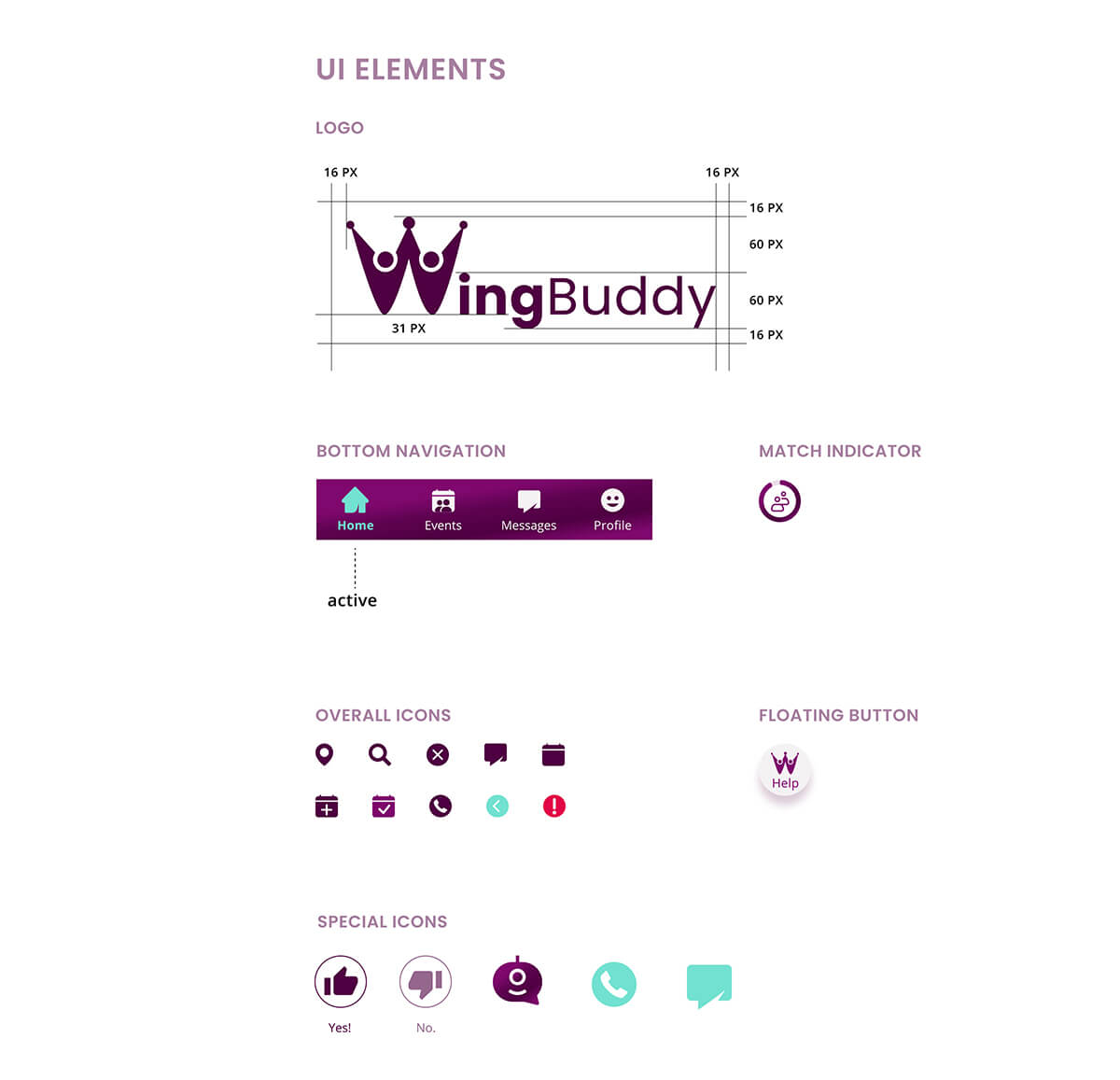
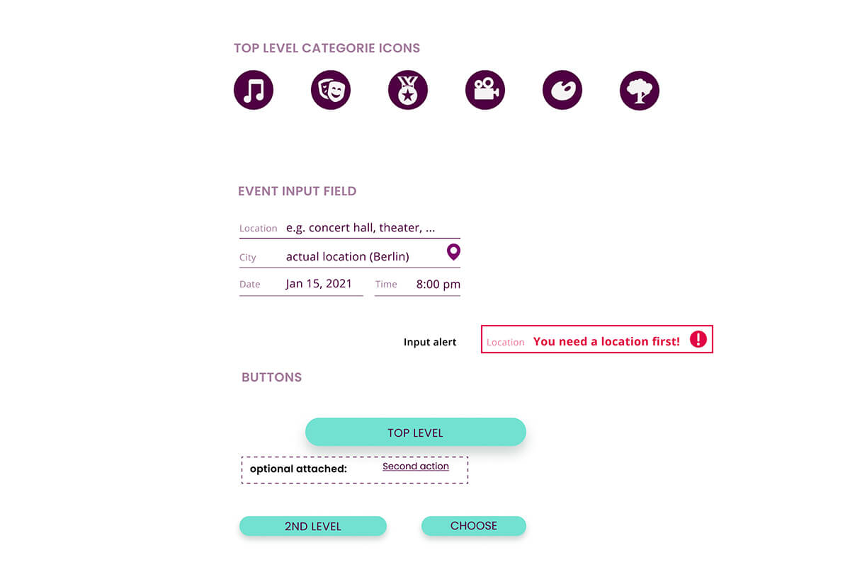
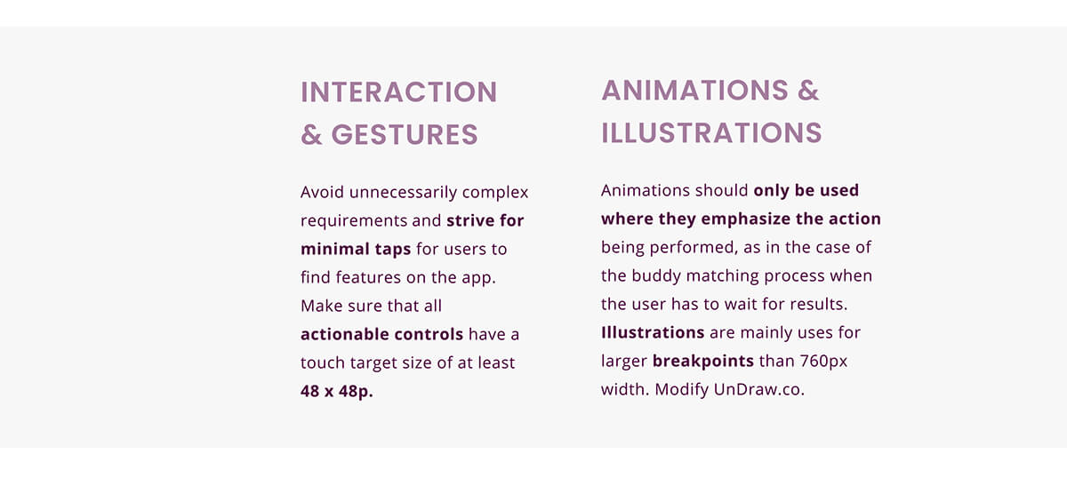
Because of the subject matter, our users will cover a range of possible dissabilities that may make it difficult for them to use digital applications. For this reason, explicit attention must be paid to making everything as easy to use as possible. Large areas, descriptions of individual actions and an obvious help option, which is otherwise often hard to find.
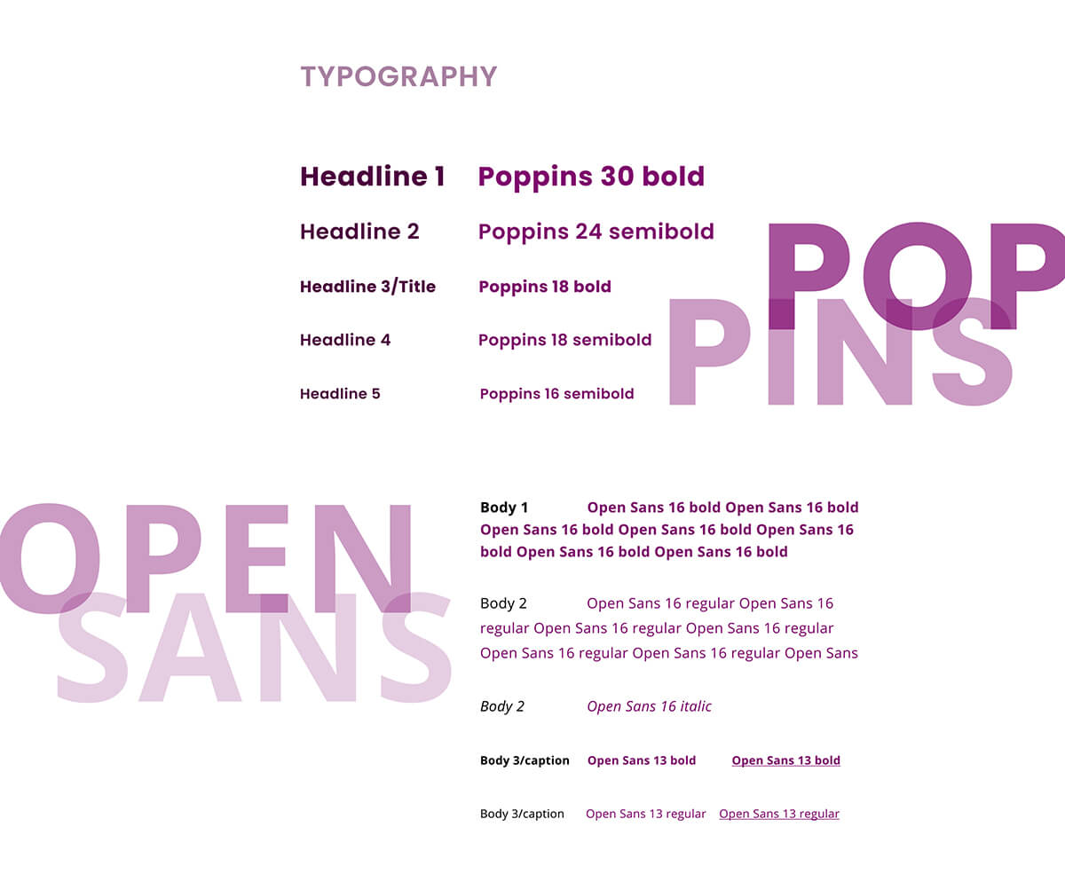
Style Guide
Wireframes
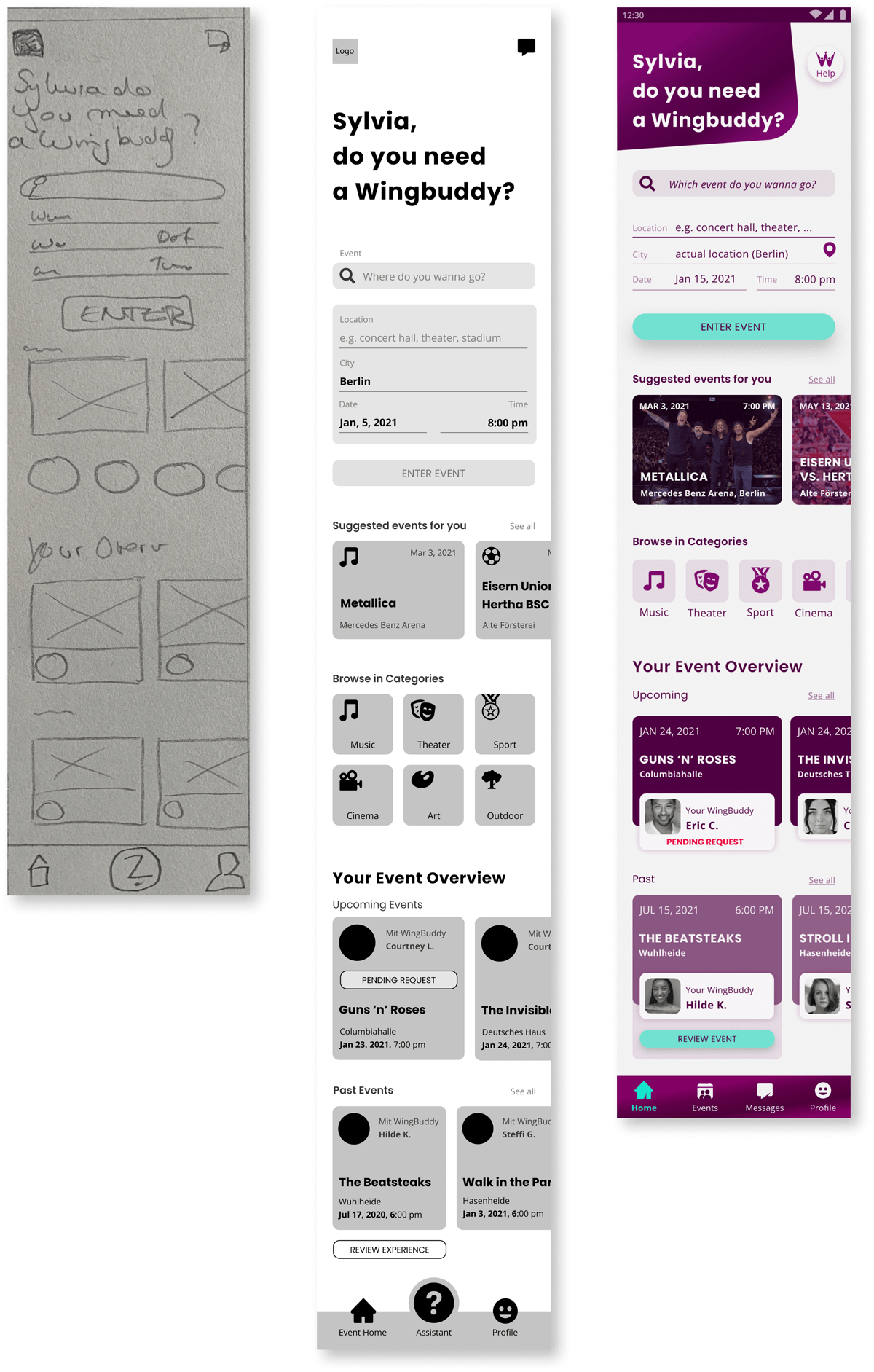
Since our users need to be able to access the application at events or otherwise on the go, I assumed a mobile first approach.
Dashboard
Main User Profile
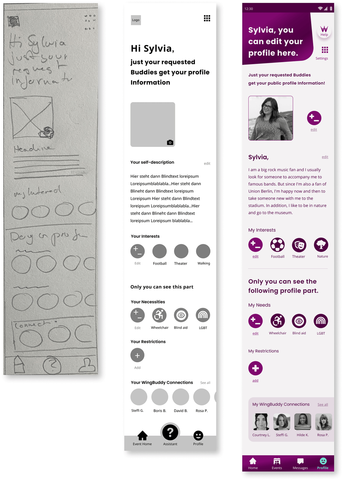
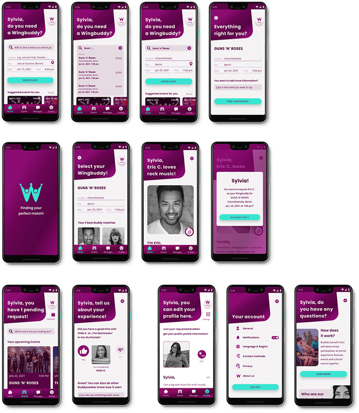
Final Screens Examples
Progressive Enhancement
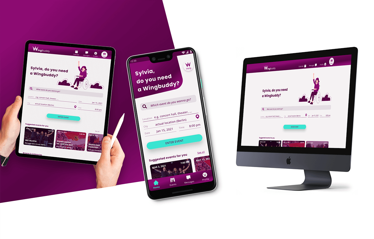
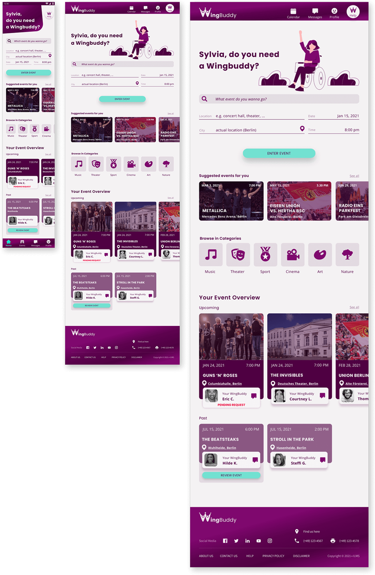
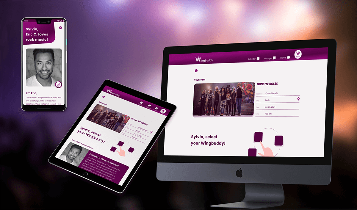
After developing the High-Fidelity Wireframes, I worked on further breakpoints for different viewports to provide users with more options and convenience on larger screens. I kept my 12-column layout, based on 8px grid and only changed the margins from 24px (mobile 360px x 640px), (iPad 760px x 1024px) and 240px (Desktop 1440px x 1024px).
Dashboard
Buddy Matching & Profile
The Future
Since this project focused on the UI, the extended user research and especially the testing of the prototype have not received enough attention so far. Having previously taken the UX Course and approached the UI task from a UX designer's point of view, the lack of my own extended research and limited capabilities and resources kept bothering me as I lacked the user's perspective during the development.
Next Steps
The next, necessary steps to move forward with WingBuddy development:
- Test with exiting users of the „Inklusion muss laut sein" buddy service.
- Extension and specification of the necessary icons for Categories, Needs & Restrictions.
- Creation of further screens, especially the onboarding and sign up process with personalization.
- Adding of necessary texts, which result from legal point of view.
- Take the actual goverment rules and Covid-19 Circumstancen in account.
